Why Visual Analytics Should Become the ‘New Normal’ in Grocery Retail - Part One
As a visual data analyst working in the retail industry, I’m always surprised by the lack of visual analytics used to aid analysis and understanding within this sector. As such, I’d like to give my thoughts on where I currently see data visualisation, where it could/should be, and the challenges and solutions to getting there.
I work in the UK grocery retail sector, working with retailers and their Fast Moving Consumer Goods (FMCG) suppliers. I have been working in this sector for 10+ years and have experienced a wide range of projects and business problems. The below is based on my experience, and not an exhaustive audit of the industry and its data practices. I’ll also focus on my experience with a grocery retailer...although it all equally applies to the FMCG supplier base, and most industries, actually!
As I have a lot to say on this subject, I’m going to split this up into three parts. In Part 1, I’ll define what I mean by “visual analytics,” explore its current usage (or lack thereof) in this sector, and share some of the reasons why it is underutilised. In Part 2 I will explore why it is such a great fit for retail, and how I think it can become the “new normal”. In Part 3 I’ll show how this implementation works in practice with a real-life example.
Grocery Retail and Data Visualisation: Where Are We Now?
The first thing to differentiate is reporting and analytics. Reporting is about showing the “what?” (What were the sales yesterday? What categories are up, year-to-date? etc.), whereas analytics is about the “why?” (Why was pet-care sales down last month? Why are the stores in London up this year?).
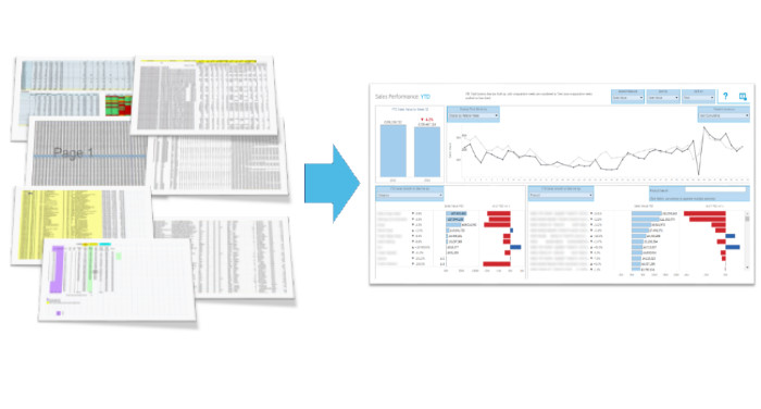
Visual reporting is the utilisation of data visualisation to allow the end-user to more efficiently digest the information in the report. This (from my experience) has been reasonably embraced within the retail sector—more so at the executive level.
Many execs now have visual dashboards. These are generally static (i.e. little or no interactivity) and only provide the “what,” which is their purpose. These differ in quality and usefulness (IMHO) but the advantage of this type of reporting versus tabular reports appears to be accepted. And although tabular reporting, especially from Finance, still dominates, visual reporting is on its way to becoming the “standard” way that this level of information is digested.
Visual analytics is the real value-adding element, as this provides the “why” and thus feeds understanding and, in turn, actions. This (in my experience) isn’t the “standard” and the data table is still king. Unlike exec-level reporting, where the “what needs to be known” is generally the same each week, analytics needs to be interactive as the user needs the freedom to explore a multitude of questions. When used together well, they form a powerful way to manage and take actions, in an efficient and fact-oriented way.
Why isn’t Visual Analytics the “New Normal” in Grocery Retail?
I only want to touch briefly on this as I’m always more interested in solutions than problems but I think it’s worth noting the main problems I’ve come across, as this helps us understand the best solutions.
First and foremost, grocery retailers are domain experts in grocery retail (...shock!). They know about the things that are important to being a retailer: running shops (both brick-and-mortar and/or virtual), supply chain, merchandising, promotions, etc. They are not experts in data science, data visualisation, or database technologies, and neither should they be.
As such, it has historically been left to IT to trial such things, who again are not experts in analytics or data visualisation, but again...neither should they be! They are experts in a different domain.
This has led to poor utilisation of these techniques, and thus, poor results. Coupled with this is the perception that these technologies are the magic-bullet answer. This was well articulated in the article, Where is the “Fix My Business” Button?
Data visualisation is a skill that takes time to learn. In fact, like all good things, you never stop learning, and it takes a business time to acquire these skills. Now retailers have employed data-visualisation consultants to help with this, but often the consultants are experts in the technology and data visualisation, but not the retail sector.
This leads to poor understanding of the problems retailers want to solve and any insights aren’t in the “language” of the retailer. Again, this leads to poor results and the perception that visual analytics is another overhyped tech/trend, and must be discarded altogether (“throwing the baby out with the bathwater” springs to mind).
Why SHOULD Visual Analytics Become the ‘New Normal’ in Grocery Retail?
Retailing at its core is a seemingly simple business. There are a finite number of things to consider: What you sell (range planning), what price you sell products at (price optimisation/promotions), where you sell (location planning), and who you sell it to (CRM).
However, each of these can’t be looked at in isolation, and due to the sheer size of a grocery retailer—the big ones have an estate ranging from 500 to 2,000 stores and around 35,000 products—we have a lot of complexity, including a high number of elements over multiple dimensions. This means that large data tables are a really inefficient and demoralising technique to answer such questions.
Retailers have people who know everything about their role (be they buyers or in supply-chain, location planning, etc.), and know exactly the right questions to ask but are unable to access the information they need to ensure their decisions are fact-based. It seems it is an industry crying out for a way to consume this information in an efficient way.
So traditionally retailers are faced with the desire (need) to base their decisions on data (facts) but without the skills (or tech) to handle and interrogate such large and complicated data sets. This means they generally opt for the “lesser of two evils” and manage by looking at their data in highly aggregated form. Our founders calls this “Managing by Averages… of Averages” in another blog post.
Errors using inadequate data are much less than those using no data at all - Charles Babbage
...but we can improve on this! We’ll explore how in Part 2.